Packaging for Snapbot
Category:
Packaging Design
Toy design
A thesis project of RISD Master of Industrial Design in 2024
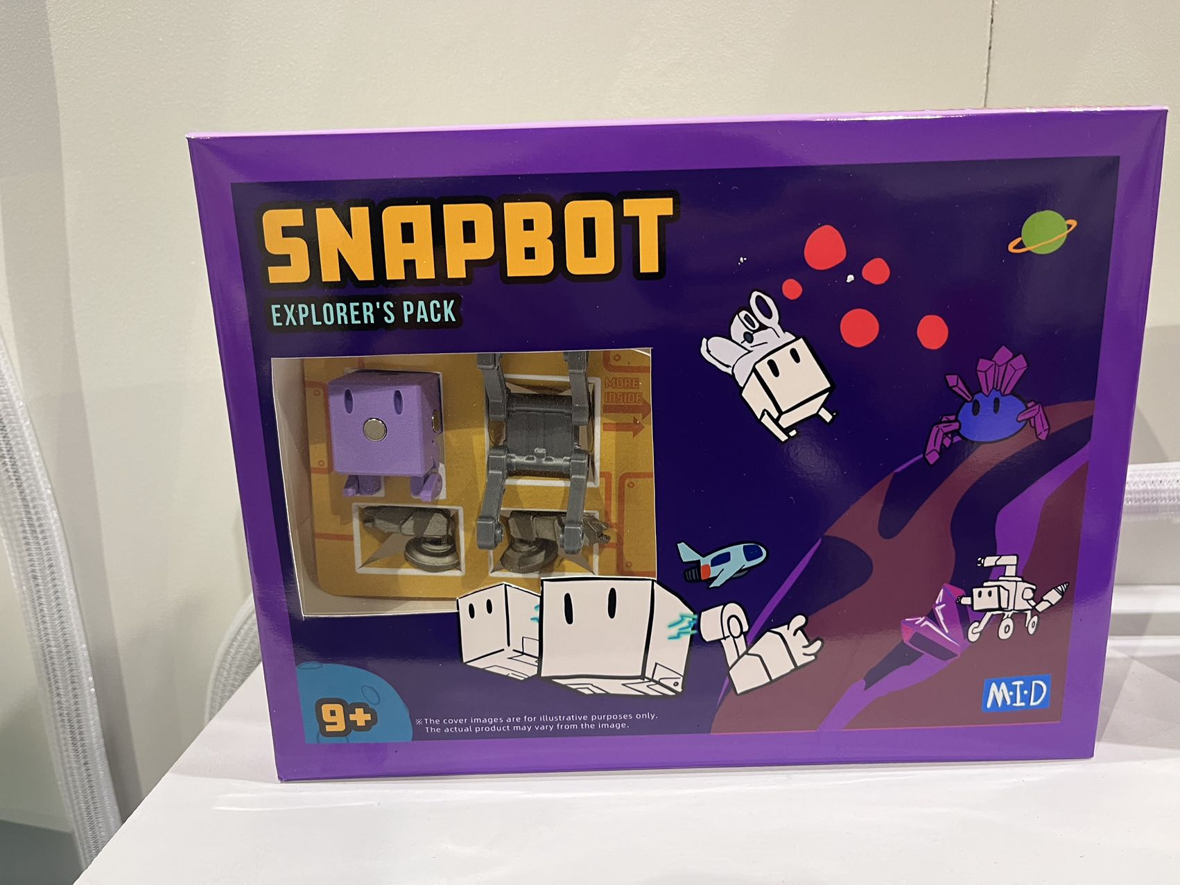
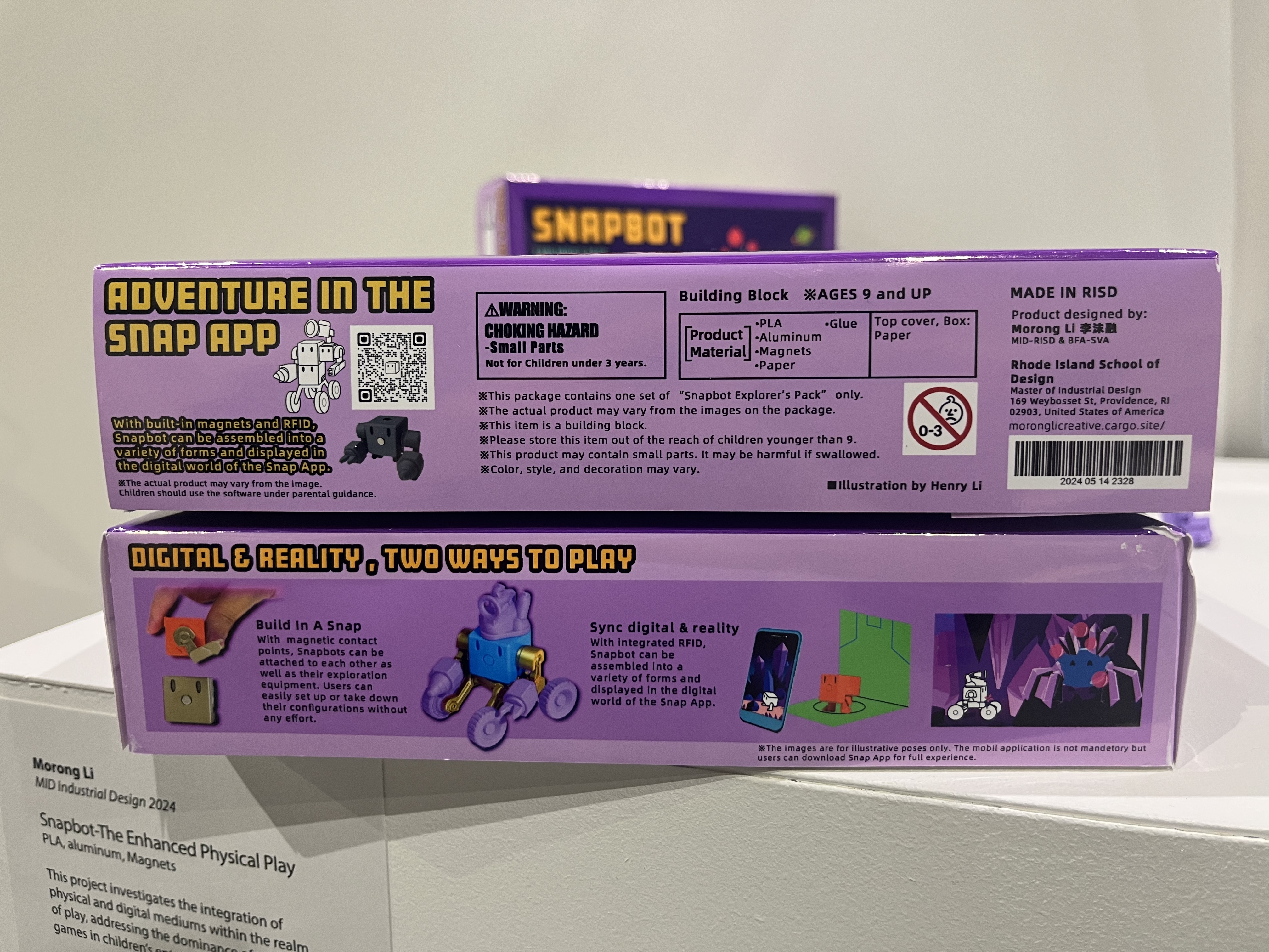
Packaging plays a large part in this project. As a toy lover, I not only want to create the physical toy, but also create the packaging to make it more fun and convincing. Before designing the package, I want to research in toy stores such as Lego, Walmart, and Game Stop. I realized toys for kids aged 9-13 has a large window to showcase what’s inside. So I came up with two solutions, a larger box as Explorer’s Pack and the bister box as Member Expansion Pack. The Explorer’s Pack contains a whole kit including the blocks, the Launch pad, and art supplies, so that the user can get a rich experience out of the box. The Member Expansion Pack contains one set of Snapbot, it is for users who only want one more figure and some parts at a lower cost.
The design and layout of this packaging is deeply inspired by plastic model kits that is popular for age over 12. I am a huge fan of model kits so i want to bring some of the art style into kids toy. For the art, I chose 2D illustration style with thick outline, the purple theme give a gender- neutral feeling, so it can be appreciated by larger population.


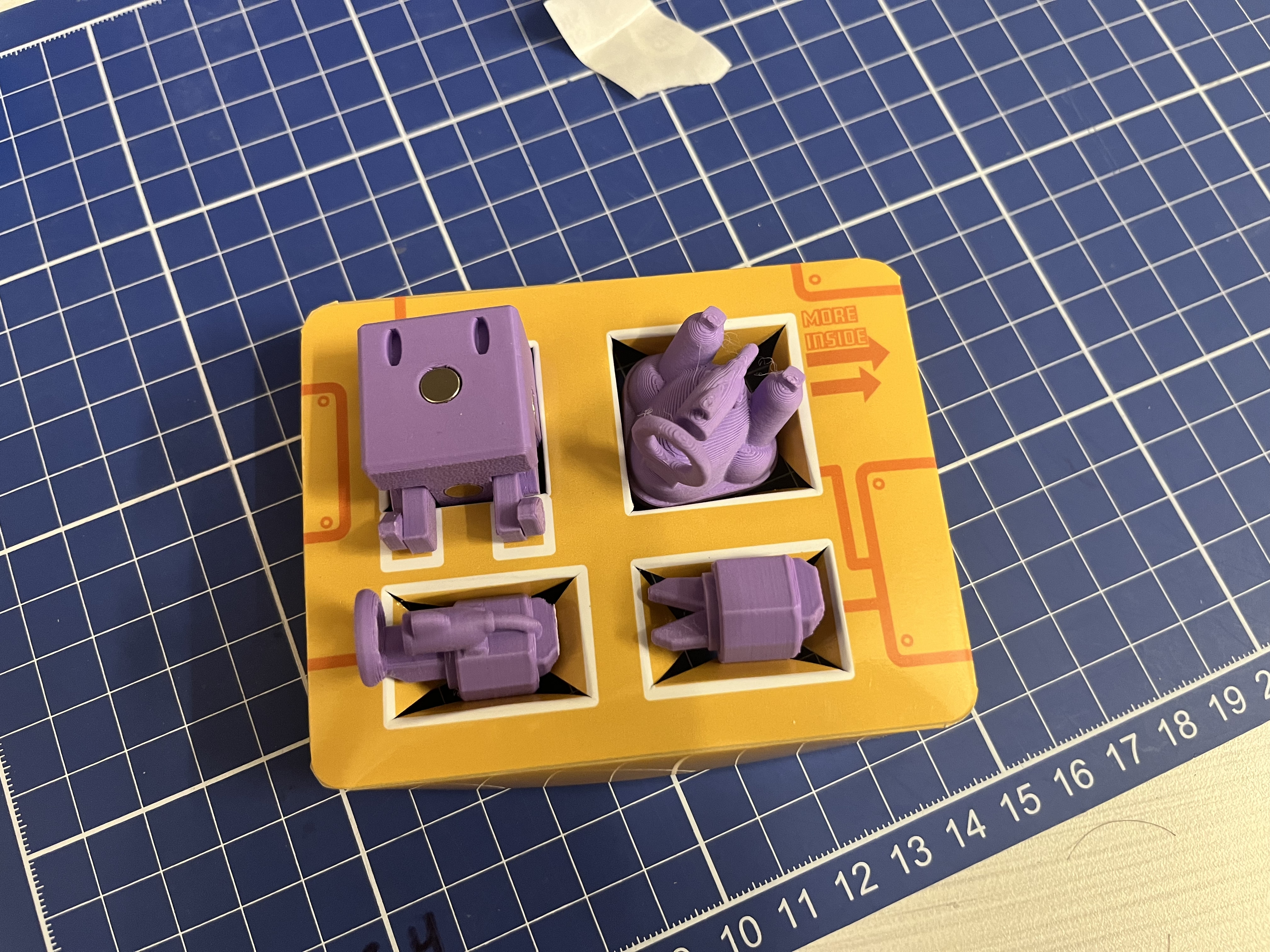
All the print was made in the Design Center of RISD, I used glossy photo paper, cut and folded them to shapes. I also designed the paper rack inside the packaging, they not only add more details to the packages but also make the theme richer.


I did all the design and arts in this project!